
6 Tips for Decorating with Prints
One of the easiest ways to instantly bring a room to life is by using prints. Here are our suggestions for incorporating prints into your home in a way that is cohesive and that suits your tastes.
Contrast
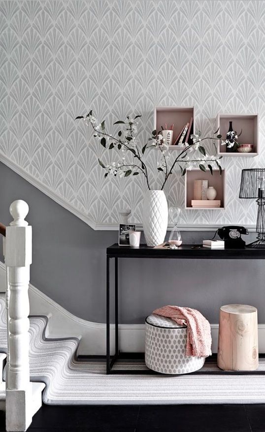
Image from House Beautiful UK
The above hallway features a small print on the ottoman, a medium-sized print on the wall, and an elongated stripe pattern on the stairs.
Create visual interest by pairing prints that contrast each other in terms of shape or size. Use a large print on a canvas on your wall and, in the same room, decorate a couch with pillows in a small print. Juxtapose a busy print with something that has ample negative space. Pair something free-flowing or nature-inspired with something structured and geometric. Another option is to use a repeating pattern for some pieces in your room and pair them with an item that uses a zoom-in of that print.
Color Selection
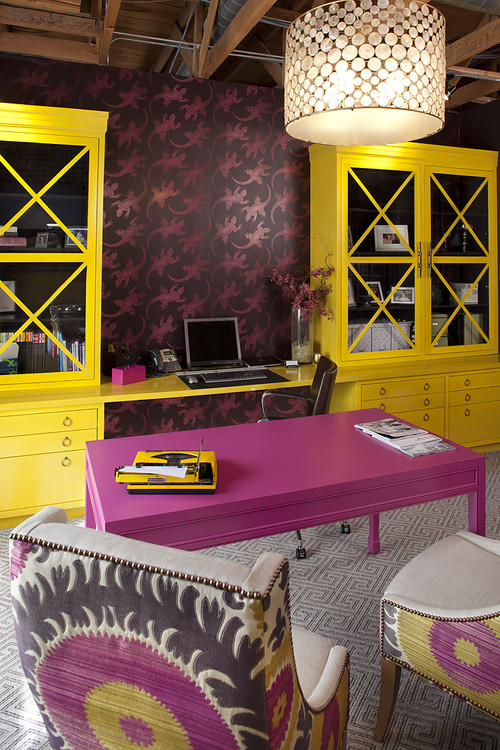
Photo by Artistic Designs for Living, Tineke Triggs - Discover contemporary home office design inspiration
This room uses a complementary color scheme paired with sandy and brown neutrals.
Choose whatever strikes your fancy! One idea is to use bold colors with muted ones. Classic color combinations such as complementary (opposite on the color wheel) or analogous (adjacent on the color wheel) schemes create visual appeal. Choose colors without a lot of contrast for a more subtle look. If you do choose highly contrasting main colors for your decor, combining that with a neutral color or with black or white can create a cohesive palette.
Monochrome
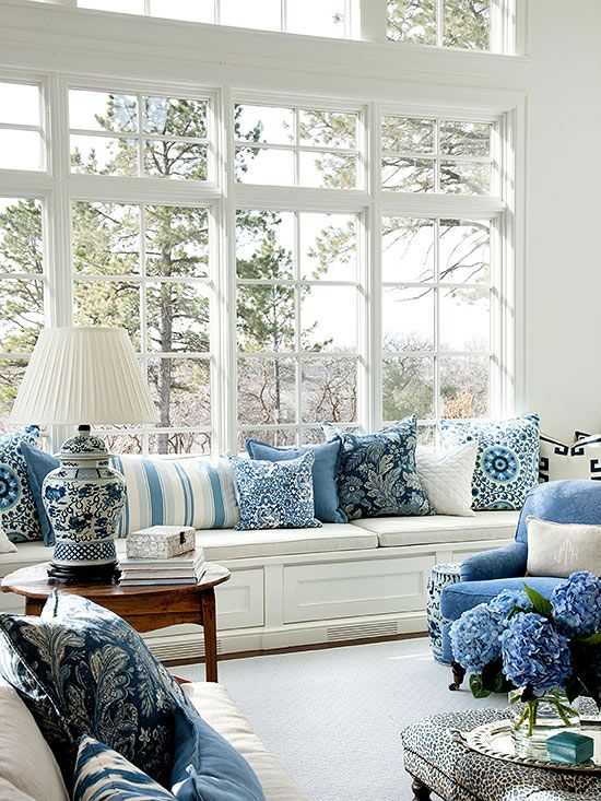
Image from Bloglovin'
Different shades of the same blue hue are used throughout this room.
If you like the interest created by prints but too much color scares you, try using a monochrome color palette. Use patterns in several different shades of the same hue for a look that is energetic but also can be low-key. It is a great idea to stick with monochrome as well if you happen to love a certain color and want to showcase it throughout a room. Using a monochrome palette also has the effect of bringing together seemingly unrelated prints in a harmonious composition.
Balance
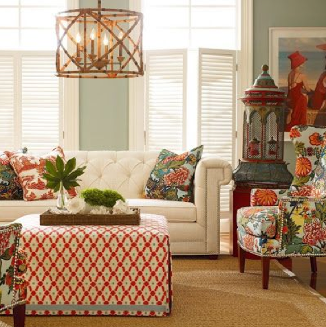
Image from Rosa Beltran Design
Prints are evenly distributed in this room.
Remember to consider how prints are distributed throughout your room. Too much print on one side and not enough on another can result in visual imbalance. For a cohesive look, spread the use of prints evenly throughout your space. Also consider how much open space used within those prints. A busy print carries more weight and should be placed with prints that are lighter.
Everything in Moderation
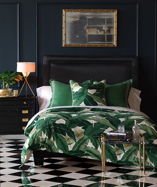
Image from Architectural Digest
Though there is a lot of print going towards the bottom of this room, there is also ample breathing space along the solid-colored the walls and furniture.
Patterns in a room are only effective if they have solid colors or blank spaces to complement them. Overuse of print can result in a cluttered, chaotic arrangement. In order to showcase the lively effect of patterns, remember to offset them with negative space.
Where to incorporate prints?
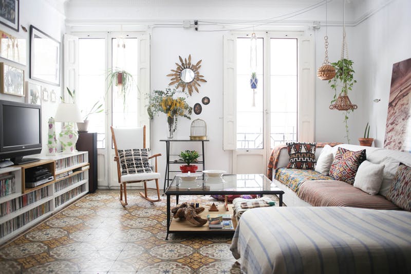
Image from Apartment Therapy
Prints are used on the floor, pillows, throw blanket, and cushion covers in this room.
The possibilities are endless when it comes to print placement. Spruce up a space with a throw blanket or printed pillows. Patterned curtains can cover a large stretch of space and are an easy way to make a splash in any interior. Another way to add a swatch of print to a wall is by hanging art or a canvas covered in a pleasing pattern. A slightly more involved but eye-catching option is to paper an accent wall with an all-over print.
These are just some suggestions to guide you through the process of arranging your home with patterns. Decorating is a matter of taste--if something comes together in your vision, regardless of oft-heard-of rules, go ahead and try it out!
Recent Posts
-

How to Light a Gallery Wall at Home
A gallery wall done well is one of the most impactful design moves you can make. A collection of fra …4th Jun 2026 -

How to Care for Your Cocoweb LED Picture Light: Essential Tips for Plug-In, Hardwired, Direct Wire, and Rechargeable Options
A great art light doesn’t just illuminate—it enhances your space and highlights your artwork’s true …19th May 2026 -

The Evolution of Lighting: Edison to LED Innovations
Imagine trying to read your favorite book, cook a meal, or navigate your home using only the faint, …24th Apr 2026