
Achieving the Perfect Contrast in Your Design
When creating a beautiful interior design, the main focus tends to be to generally make the design both attractive and functional over all. In some people’s eyes, however, ensuring the colors are well-coordinated is a big step. Color is, in fact, a major component of an interior design.
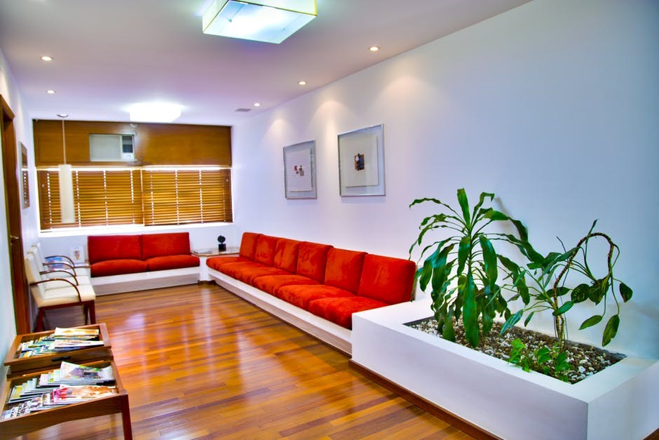
Apart from ensuring colors match or complement one another in an interior design, it is important that there is a healthy amount of contrast. Contrast can be described as a visual difference that makes two things stand out from one another, or in this case, two different neutrals or colors that are strikingly different: one dark and one light. Take black and white as an example or even dark gray and baby blue. Contrast, however, can take on other forms too that go beyond just color.
But how does one achieve the right amount of contrast in their interior design? Our Cocoweb.com experts would be glad to show you the ropes.
Don’t just focus on darks and lights; consider mediums and lights or darks and mediums to provide contrast too.
When creating contrast in an interior or even in exterior design, know that contrast doesn’t mean you have to use colors that are completely opposites when it comes to brightness and darkness. In fact, some people may not want to have a heavy amount of contrast in their design at all – and that’s okay.
Creating contrasting colors in your design tends to revolve around picking an additive and a subtractive color or choosing colors that have different values (lighter, middle, or darker). Contrasting colors can even be the same hue but just with a different value. That said the color combination or scheme can be monochromatic, analogous, complementary, the list goes on, as long as the colors provide a variation in their value.
As some examples, here are some color combinations that aren’t as contrasting as, say, black and white but still nevertheless provide contrast in a design:
- Navy and yellow
- Bubble gum pink and hot pink
- White and burnt orange
- Blush and medium gray
- Tan and dark brown
- Teal and black
From the above examples, you’ll notice that some of these color combinations may include a neutral and a color, two neutrals, or even two colors. Some of the colors used also have variations of value. They may provide opposite values (i.e., light and dark) or similar values (i.e., light and medium, medium and dark) You can, of course, also provide contrast with more than two colors.
Not everyone likes a lot of contrast in their design; some prefer a very clean, white space. If this is you, you can add mild contrast with whites and light to medium neutrals or even by adding a pop of color you use vaguely throughout the space.
For added drama, consider adding metallic accents.
If you like a bit of industrial or flash-y touches, consider adding some metallic accents. Depending on the colors throughout your space, there will be different metals you may wish to consider.
Here are some metal and color combinations you may like that provide gorgeous contrast:
- Tan and galvanized silver
- Purple and gold
- Indigo and copper
- Mint green and bronze
- Maroon and brass
On top of that, you might even want to contrast with two or three different metals in your space. But generally, you won’t want to make metallics the main focus on your interior design as the roughness, masculinity, and shininess of many metals can appear “loud” in a design.
But overall, adding metallic accents such as metal legs on a coffee table, metallic plant pots, light fixtures, picture frames, or candle holders are great places to start.
Create contrast with other elements other than color.
Understanding that contrast doesn’t just have to be just with color is important if you wish to provide the right amount of contrast throughout your space overall. You can play around with different textures, materials, patterns, and shapes to amp up your design perfectly.
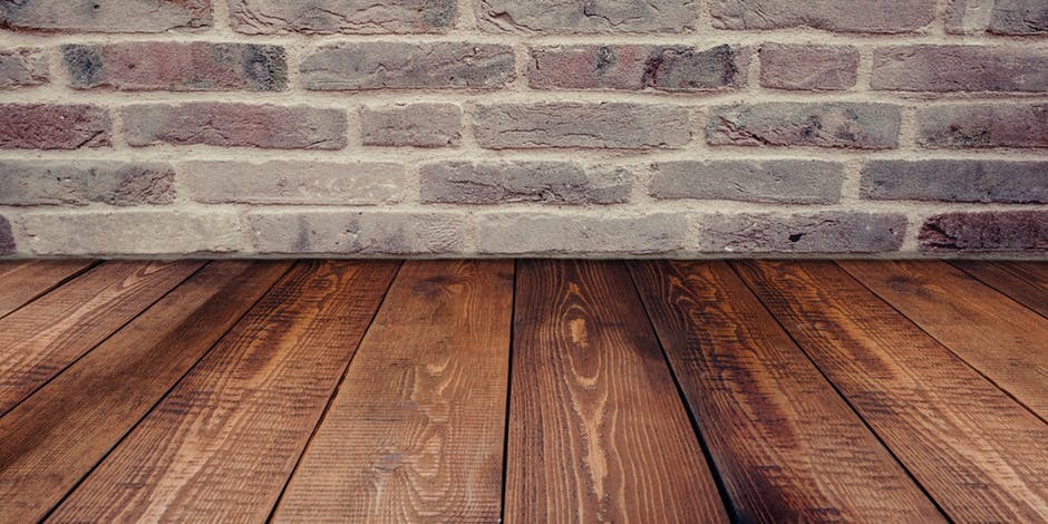
As an example, one may use variations of smooth and rough woods in their space, add fluffy pillows to a rougher leather couch, opt for rounded furniture or other objects (e.g., a table, pillows) in a room that contains a lot of angles and lines, or even use a floral print in a room characterized by mostly solid colors.
While color tends to be the first thing people notice when it comes to contrast in an interior design, you don’t have to make contrast obvious and easy to spot for your contrasting colors, shapes, textures, or other elements to work well in your design. Sometimes it’s the discrete aspects of your design that make it well put together and attractive overall.
Mixing things up here and there can be a great way to provide contrast. But all in all, you won’t want to provide too much of anything: too much of the same colors, shapes, textures, metals, and so on. That leads us to our last point.
Balance is key.
Regardless of the types of contrast you add to your design, balance is everything. Balance on a broad scale is important when it comes to interior design. However, balance tends to mean different things to different people.
Balance in this case refers to not utilizing too much nor too little of contrast. For example, in a room that features black and white objects everywhere the eyes look, this may be too much contrast in some people’s eyes, and thus, not providing the right amount of balance between other elements in the space. However, a design that features very little contrast and mostly has a single color or single texture present in the space may also not be balanced in the sense that there is lack of variation and contrast in the design.
That said, if your space is looking bland, adding more contrasting elements, especially noisier ones, may be important. In a crowded, busy space, adding solids or more feminine objects may be key to toning down your interior design, providing balance in the process between obnoxious and calm.
Keep in mind that balance doesn’t necessarily mean consistency, but consistency can be a great way to provide balance in an interior design. Consistency can be achieved by providing contrasting elements throughout the design rather than just, for example, on the couch or in one corner of the room.
Conclusion
Achieving the right amount of contrast in your design doesn’t need to be difficult to make it work. In the end, the type and amount of contrast you seek to provide in your space is all up to you personally. As mentioned, not everyone is going to like a bold contrast; some prefer something more subtle or hard to recognize.
But overall, remember that contrast in a design doesn’t have to be incredibly obvious to work. It also doesn’t need to only be provided by use of color. On top of that, contrast can be beautiful between two different elements such as a color and a metallic. In the end, balance is key. Don’t try to make contrast the emphasis of your design. Instead, use contrast to create a variation in your space and play around with the eyes a little. There is such a thing as too much contrast after all.
If you need more interior or exterior design-related tips and tricks, check out the rest of our blog posts .
Recent Posts
-

The Evolution of Lighting: Edison to LED Innovations
Imagine trying to read your favorite book, cook a meal, or navigate your home using only the faint, …24th Apr 2026 -

How Proper Lighting Stops Eye Strain
We spend hours bathed in the glow of computer screens, harsh ceiling lights, or dim desk lamps. Then …24th Mar 2026 -

Post Light Mistakes to Avoid When Lighting Your Pathways
Lighting your pathways with post lights can instantly boost the safety, functionality, and curb appe …16th Mar 2026