
Bay-Inspired Palettes For A California Family Home
There are many things to love about California: sunny weather, plenty of attractions and things to do, hefty cultural inspiration, and many sights to see. In fact, just in one of 50 states, California houses an incredible variation of landforms and bodies of water including mountains and hills; valleys; lakes, bays, and oceans; deserts, caves, ridges and reefs, the list goes on
For the latter reason, it’s no surprise that many consider California as an inspiration for their interior design. For others, they love California so much that they go as far as to make the move to the Golden State.
Whether you live in California or not, Bay-inspired color palettes are quite relaxing, simple, yet gorgeous for both modern and traditional homes. The use of blues, pastels, and neutrals makes Bay palettes highly versatile for most interior design tastes.
Speaking of which, here are five incredible Bay-inspired color schemes your family home will thoroughly thrive with:
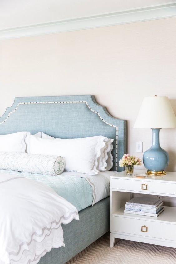
Palette 1
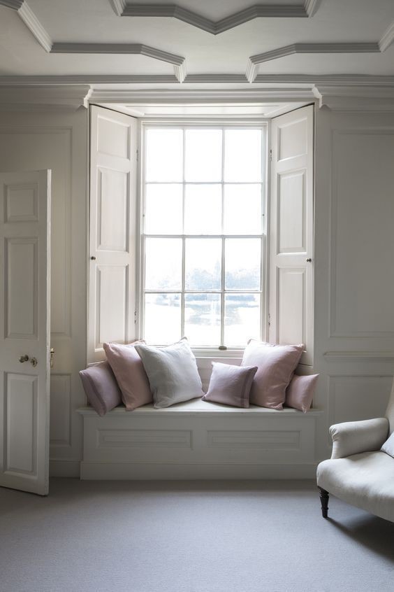
Starting off with this calmer Bay-inspired palette, the first words that might come to your mind might be “pastel” and “neutral.” It’s certainly soft and dreary, that’s for sure. That said, a palette like this one is ideal for the bedroom or other rooms in your home that you wish to have a very simple, light, and air-y feel.
This Bay-inspired scheme is unlike other Bay-inspired palettes. While this palette includes pastel pink and lavender, the use of Light Steel Blue, Gainsboro, and Dim Gray give this palette essentially mimic the fog accumulating over the peaceful San Francisco Bay.
Sometimes a soft, pastel palette is exactly what our interior or exterior design needs to allow us to unwind after a stressful day. However, if you want to give this palette contrast, opt for a muted black to offset the softness. Additionally, consider adding dark green in the form of live or faux plants to bring some liveliness to your design.
Colors to Use:
- Light Steel Blue #B0B5C4
- Light Steel Blue #C0C5CF
- Gainsboro #E6E5E4
- Dim Gray #74706A
- Muted Black #302D29
Palette 2
While many Bay-inspired schemes feature white and blue, to create a slightly warmer design, you might consider going for a brown-based palette. The brown and tan hues in the featured interior design mimic the shady shore of the Bay, and the medium gray is inspired by the San Fran fog. Many may find that this palette is slightly more beach-y than Bay-inspired. In reality, beaches and bays have overlapping colors and features, making their palettes not far off from one another.
The use of both gray and brown in this palette works phenomenally considering there are dusty, gray-based tans and browns utilized that help complement the true grays featured. If you opt for this color palette for your family home, make sure to add a little blue here and there if you wish to add a touch of color. Adding blue can signify the beautiful, blue waters of the San Francisco Bay.
Colors to Use:
- Tan #D5C7B8
- Dark olive brown #5F4D3A
- Chocolate brown #514032
- Medium Gray #9E9489
- Charcoal brown #312A23
Palette 3
For a palette that is a touch livelier, you might consider one similar to the one featured in the above interior design. The use of bright white alongside playful Rosy Brown, shades of pastel sky and baby blue, and lighter grays make this palette playful, vibrant yet muted, and positive.
Besides looking stunning in a California home, this Bay-inspired color scheme can look gorgeous in traditional, farmhouse, and urban interior and exterior designs. The beauty of this palette – besides the hues themselves – is the variation the scheme provides in terms of using both cooler and warmer colors while making them complement one another aimlessly.
Additionally, the fact that the darker hues used in this palette are generally not that dark at all suggests to us that one can definitely achieve adequate contrast in their interior design with lighter colors alone. Lastly, it is incredible how this entire palette has an old-fashioned and contemporary feel at the same time.
Colors to Use:
- Tan #D3AC8A
- Rosy Brown #A47E60
- Gainsboro #DDDDDC
- Light Slate Gray #919692
- Dark Slate Gray #494F4B
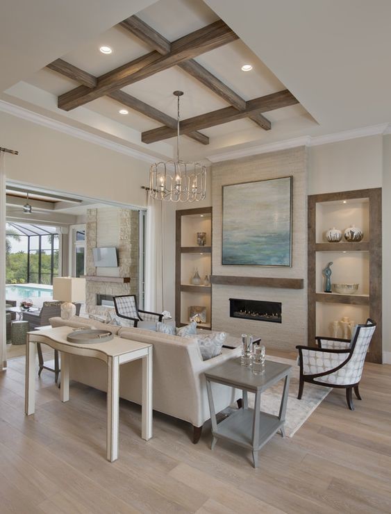
Palette 4
If conservative and subtle is your preferred interior or exterior design style, this next California Bay Area palette might be most suitable for you. The more old-fashioned feel of the colors used in the featured design are both soft and inviting. With a basis consisting of browns/tans and gray, you have the perfect neutral backdrop to add a splash of blue.
Because this color palette tends to be very mild, the designer was genius to add a striped couch into the design and a playful chandelier to jazz things up in the design. Additionally, it was wise that the use of texture is added in a triangular-like manner, rather than lumped in one section of the design, to keep the eyes moving around the design. Texture is mainly present in the wall painting, plants, and baskets. Baskets and a plant are placed on both sides of the room, although with objects of different sizes, to create playful, asymmetrical balance.
Colors to Use:
- Dark Olive Green #5C8C3D
- Dark Olive Green #695342
- Light Gray #D2CFBF
- Dark Olive Brown #453D2D
- Medium Gray #888272
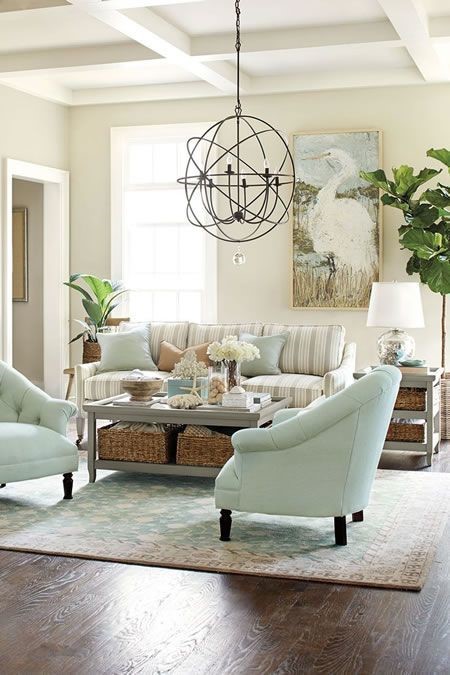
Palette 5
Achieve the perfect balance of warm and bubbly with this last Bay-inspired color scheme. The use of neutrals in this design is intriguing. The creamy Gainsboro and the use of grays add coziness while the use of white provides instant cleanliness and boldness for the space. While the use of these three neutral colors might otherwise be avoided – because if used incorrectly, they can quickly clash – their appearance together in this design prove that they belong together.
And of course, how can we neglect the use of gorgeous Cadet Blue in this palette? This blue-gray hue complements the darker gray in this palette which both then contrast the white and tan in the design. Best of all, the use of half warmer hues and half cooler hues in this featured interior design are absolutely genius for a bedroom considering warmer hues contribute to relaxation while cooler hues offer wakefulness and feed creativity, offering the best of both worlds for the homeowner.
Colors to Use:
- Cadet Blue #6C94A4
- Rosy Brown #C1B29D
- Dim Gray #565551
- Gainsboro #E9E7E6
- Light Slate Gray #898F90
Conclusion
Whether you reside in the beautiful Bay Area of California or simply wish to bring some Californian flair into your home, the latter Bay-inspired color palettes are absolutely suitable for both interior and exterior designs. These five peaceful palettes are soft on the eyes as they are on our mental and emotional states, making them applicable for every room in the home from the bedroom to the living room.
One of the most beautiful aspects of Bay-inspired color schemes is that no two are identical. While these palettes generally include pastels, gray-based hues, neutrals, and often a touch of blue, you still have the power to incorporate your personal tastes whether you prefer a more colorful or calmer interior or exterior design.
If you need more interior or exterior design-related tips and tricks, check out the rest of our blog posts.
Recent Posts
-

How to Light a Gallery Wall at Home
A gallery wall done well is one of the most impactful design moves you can make. A collection of fra …4th Jun 2026 -

How to Care for Your Cocoweb LED Picture Light: Essential Tips for Plug-In, Hardwired, Direct Wire, and Rechargeable Options
A great art light doesn’t just illuminate—it enhances your space and highlights your artwork’s true …19th May 2026 -

The Evolution of Lighting: Edison to LED Innovations
Imagine trying to read your favorite book, cook a meal, or navigate your home using only the faint, …24th Apr 2026