
Picking The Right Color For Interior Design Based On Personality
Selecting colors for your space can be daunting considering how many hues exist out there. Even if you’re certain you want to paint the walls of your living room red, there are numerous shades to pick from: wine, ruby, candy apple, scarlet, crimson, auburn, carmine, the list continues seemingly forever. You might even find yourself stressed or anxious through the color selection process, and quite frankly, we don’t blame you.
However, it’s not just about picking the right color or combination or colors for your interior design; it’s also important that you select colors based on the mood or personality you wish your space to represent. In turn of picking the right colors, you can ensure that the mood present in your space will rub off onto others.
Depending on what you want your space to represent mood-wise, we have some colors that will be perfect for your interior design.
Cheerful
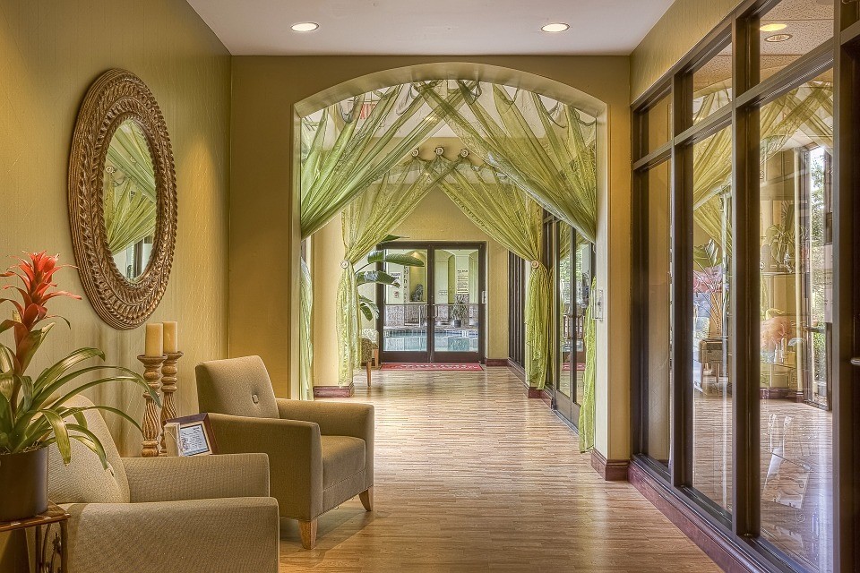
When thinking of cheerful colors, yellow and orange tend to come to mind first. After all, yellow is the color of the sun, and orange, well, it’s not too far off from its yellow counterpart. Plus, both yellow and orange are some of the colors that humans, animals, and even insects are the most sensitive to due to their bright disposition.
Thus, you might consider yellow and orange to be the best colors for an interior design that you wish to be cheerful and positive. However, there are of course other colors, and more specifically, certain shades of various colors that you may wish to focus on. These range from soft pastels to fruity neons.
You might wish to use cheerful shades for kitchens, living rooms or family rooms, bathrooms, playrooms, or children’s bedrooms (as long as the colors aren’t too loud and bright, so the child can still go to sleep).
Cheerful Shades:
- Apricot
- Cadet Blue
- Lime
- Creamsicle
- Melon Orange
- Turquoise
- Lemon
- Sky Blue
- Spring Green
- Peach
- Ballerina Slipper
- Tangerine
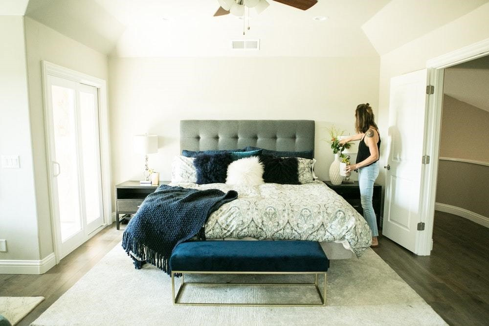
Laid Back
For bedrooms, bathrooms, casual dining areas, and living rooms or family rooms, some may prefer things to be laid back and relaxed. Usually, a laid-back color scheme is ideal for spaces where people will sleep, pamper themselves, casually hang out with loved ones, unwind after a stressful day, or watch television.
Relaxed colors are also applicable for those who have busy, stressful lives. But thanks to the power of psychology, there are plenty of shades out there that will help you get back to equilibrium. These shades usually contain brown, green, or blue as their base. However, they can certainly include other dimmer pastels and deeper, vibrant colors.
The goal when picking laid-back colors is to ensure you select ones that aren’t super obnoxious yet also ones that are not too dark. Colors that are too dark can come off as romantic, formal, or at times, depressing. Therefore, shy away from those shades, and instead opt for shades that are still inviting and a pinch playful.
Laid Back Shades:
- Burnt orange
- Forest Green
- Cobalt
- Magenta
- Sage Green
- Lavender
- Chocolate brown
- Grape
- Cream
- Seafoam Green or Blue
- Mauve
- Tan
Sophisticated
Some people like their home to be more formal. However, others prefer just a few rooms in their home like their dining room, master bedroom, or formal living room to be and feel sophisticated. Regardless, the use of the right colors can ensure your interior design has the exact formality that you’re looking for.
Usually when it comes to selecting sophisticated shades, they are usually red- or blue-based hues. Of course, formal hues don’t necessarily have to feature a red or blue base, but what they must have is a relaxing or romantic sensation to them without be too dull or depressing.
If you love brighter hues, instead go for a shade of it that features a gray base. When considering sophisticated hues, also consider the variation of darker berry colors out there that will certainly give formality to any room in your home.
Sophisticated Shades:
- Royal Blue
- Teal
- Olive
- Mulberry
- Camel
- Rosewood
- Burgundy
- Taupe
- Boysenberry
- Indigo
- Charcoal
- Hunter Green
Motivational and Creative
In some parts of the home, we want our space to be cheerful without being too playful. There are also times where we want our spaces to be sophisticated and professional without being too uptight and formal. This is especially true for home libraries, offices, study rooms, arts and crafts rooms, and the like. However, we tend to place bland, boring neutrals in these spaces rather than creative and motivational hues.
Find ways to merge joyful colors and formal colors to ensure your space is able to feel your motivational and creative juices when you spend time in it. While blue is typically one of the most productive colors while green is sometimes seen as a hue that feeds our creativity, keep in mind that other shades can also do the trick.
When opting for motivational and creative shades, consider medium to bright pastels or medium shades of your favorite colors. Use brighter hues sparingly in your space as to not distract you from your mental or physical work.
Motivational and Creative Shades:
- Cerulean
- Baby Blue
- Pineapple
- Chartreuse
- Cotton Candy
- Periwinkle
- Coral
- Persian Blue
- Mango
- Wintergreen
- Saffron
- Arctic Blue
Versatile
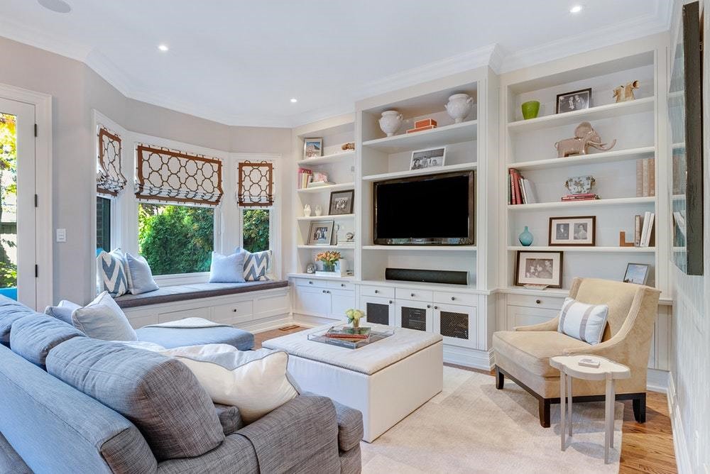
There are some rooms in the home like the living room or family room that we want to represent different moods. Some might want to feel relaxed in their space sometimes but also want to feel motivated and creative at other times.
For instance, most use their living room or family room space for not just lying down on the couch watching television or a good movie with family but also for playing games with guests or indulging in deep conversations with loved ones. For some families, their living room or family room also doubles up as a play room for their little ones. The bedroom is also considered a versatile place which is often used for playing, reading, studying, and of course, sleeping.
When looking for versatile colors, it’s best to go for neutrals, lighter gray-base hues, conservative pastels, medium shades, and/or gender-neutral colors. As you pick the right versatile hues, make sure to ask yourself if those colors make you feel happy, relaxed, motivated and creative, and sophisticated at the same time. Imagine yourself in various situations – like lying down and casually reading a book or working on an important project – as you decide if a color is versatile enough for your space or not.
Versatile Shades:
- Ivory
- Beige
- Rose Quartz
- Pear
- Wisteria
- Salmon
- Grass Green
- Light Steel Gray
- Ruby
- Sapphire Blue
- Honey
- Oatmeal
Conclusion
Color is a beautiful thing. However, picking out colors you love or colors that you think will look good together in the same interior design is just not enough. You also have to consider the mood the colors you select will give your interior design, and thus, your guests. You might consider having a relaxed bedroom with shades of blue or a cheerful living room or family room with the use of bright, positive colors.
Regardless of what room you’re selecting colors for or what hue you decide to pick, always consider psychology an integral part of the specific shades you opt for to place in your interior design. Colors are great measures of our personalities, how we think, and even how we feel, and in turn, how we may behave. So, make color count in your home setting; it’s not just an important aspect of art but also design.
If you need more interior or exterior design-related tips and tricks, check out the rest of our blog posts.
Recent Posts
-

How to Light a Gallery Wall at Home
A gallery wall done well is one of the most impactful design moves you can make. A collection of fra …4th Jun 2026 -

How to Care for Your Cocoweb LED Picture Light: Essential Tips for Plug-In, Hardwired, Direct Wire, and Rechargeable Options
A great art light doesn’t just illuminate—it enhances your space and highlights your artwork’s true …19th May 2026 -

The Evolution of Lighting: Edison to LED Innovations
Imagine trying to read your favorite book, cook a meal, or navigate your home using only the faint, …24th Apr 2026