
Spring Fever: 6 Hot Interior Design Colors For The Season
Spring is a season many of us love. This season is mild, sunny, breezy, and filled with blue skies and chirping birds. Spring is also a season we consider fresh and livening as we witness new plant growth, blossoms, and the birth of new life in the animal kingdom. The meek and mild weather of spring and the many beautiful characteristics its applicable months hold is downright exciting and peaceful at the same time.
While many regions across the United States are still chilly and/or are even still blizzarding, it’s a good time of year to start thinking about the colors you might want to include in your interior design in the coming days, weeks, or months. Some think of pastels when it comes to springtime while others think of vibrant, bold hues from eggplant purple to turquoise.
For 2019, the top spring interior design colors are definitely leaning towards harsher pastels and moody mutes. Consider adding the following to your home this season:
1 - Dusty Blue
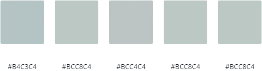
For those who have a love for both purples and blues, Dusty Blue is perhaps the best color to add to your interior design this spring. Looking at this color, some may see a grayed-out blue. However, others may see a muted lavender. Either way, that’s one of the many things that makes this hue unique; it’s essentially “feminine” and gender-neutral at the same time. Additionally, this color is quite versatile as we transition from winter to spring considering that its deeper, grayer base is melancholy yet playful at the same time.
Dusty Blue looks especially phenomenal with a gold or yellow accent. Greens also look great with this blue color. You may even wish to pair this moody blue-purple with a true blue or purple to give the eye a comparison between different shades of blue or purple.
2 - Mushroom
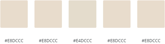
If you like pink but fear placing it in a home setting because you worry it will look too girly or even tacky, go for a creamy, tannish shade of Mushroom which tends to have a slight pinkish tone to it. This color is certainly different from your average pink, tan, or beige. Nevertheless, it has a spring factor to it and even a slightly purplish shade in it that make it applicable for the winter months as well.
But because Mushroom tends to be a little pink or purple, you may still want to use it sparingly in your interior design as these two colors still tend to be considered abnormal in interior design to date. Additionally, this shade is more on the rustic and antique side, making it a good idea to limit your use of this color, particularly in a modern space. You might consider opting for this color via sheer curtains, an accent throw pillow or two, candles, a vase, or a throw blanket.
3 - Gold Muted Chartreuse
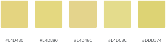
One of the first colors that comes to mind when we think of spring is the color yellow. Yellow is the color of the sunshine, freshly-hatched chicks, and bloomed daffodils. To top it off, it’s also the color of a leprechaun’s belt buckle and Irish gold, and not to mention, the color we dye some of our Easter eggs. Thus, it is a great color for this time of year.
If you’re not much of a yellow person or simply don’t like adding harsh yellow to the home setting, no worries. Gold might be your go-to pick for 2019. However, we particularly suggest going for Gold Muted Chartreuse. Some shades of this color are a little greener while others have a brownish or orangish/reddish feel to them. Regardless, Gold Muted Chartreuse is a fun shade of yellow-green that is applicable for not just spring but also winter, late summer, and autumn if you pair it with the right colors.
4 - Lilac Gray
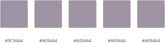
Lavender is a beautiful color, and so is gray. But why not combine them with Lilac Gray? This muted purple hue is deep and dark yet still subtle and not entirely melancholy. Lighter shades of Lilac Gray tend to still have cheery notes. Yet, Lilac Gray, considering it is a darker color, is not just a great color for springtime but also for winter and autumn as well. Many don’t often choose hues this dark for spring. Instead, they opt for its pastel counterpart or for a tone that is more vibrant yet still vivid. However, with gray-based hues being hot in 2019, Lilac Gray makes perfect sense for this spring.
It’s a good idea to pair Lilac Gray with lighter colors like Spring Green, pale lavender, a light pink or blue, or ivory or cream. Nevertheless, this is a color that is excellent when it comes to adding a pinch of formality and sophistication to your interior design. It also makes a great bedroom wall color as it is peaceful and plenty dark enough to sleep well with.
5 - Duck Egg
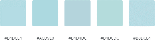
Shades of blue that are usually chosen for spring and Easter décor include Baby Blue, Sky Blue, and Turquoise. However, some might like to tone it down with a grayer, calmer shade of Duck Egg, especially in 2019. Considering Duck Egg isn’t as vibrant as usual blues chosen for this time of year, it makes a great color for winter as well. Misty Blue is another similar color to Duck Egg that would also be applicable for springtime.
Duck Egg is especially a great color for a bedroom, bathroom, living room, or family room – or really, anywhere else you would like a calming, soothing color. Blue is already tranquilizing as is, but the grayer base of this color makes it even more peaceful, yet without being too calm or depressing.
6 - Pastel Butterscotch
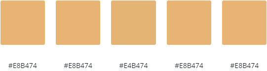
Lovers of browns and oranges may love adding Pastel Butterscotch to the inside of their home. Although orange and brown are colors many enjoy in general, both can appear too harsh in a design if the right shades are not selected. However, with a butterscotch hue like the ones pictured above, you get the best of both words: a darker color with a creamy-orange base that looks stunning as the weather changes from frigid to warm.
Besides being a great color for winter through spring, you bet that Pastel Butterscotch is also suitable for autumn and summer! Its orange base may remind someone of a cold Creamsicle pop in the heat of the summer while it may give people pumpkin spice vibes in the fall.
Conclusion
Spring is a great season for just about anyone. This season includes great hiking, fishing, and dog-walking weather. Yet, there are days where it is still warm enough to take a quick dip in the pool or drink a chilled glass of tart-and-sweet lemonade. Then, occasionally, you might have a mild, rainy day. The versatility and the peace spring gives is enticing to say the least.
In celebration of the season changes and the great weather that comes along with it, it’s the perfect time to select and add gorgeous springy hues into our home. For 2019, the best colors to consider placing in your home include Dusty Blue, Mushroom, Gold Muted Chartreuse, Lilac Gray, Duck Egg, and Pastel Butterscotch. As for any other colors you may select, focus on muted and moody pastels. Go for things that are gray base or considered “dusty.” Selecting colors like these, you’ll have a spring-ready home interior in no time!
If you need more interior or exterior design-related tips and tricks, check out the rest of our blog posts.
Recent Posts
-

How to Light a Gallery Wall at Home
A gallery wall done well is one of the most impactful design moves you can make. A collection of fra …4th Jun 2026 -

How to Care for Your Cocoweb LED Picture Light: Essential Tips for Plug-In, Hardwired, Direct Wire, and Rechargeable Options
A great art light doesn’t just illuminate—it enhances your space and highlights your artwork’s true …19th May 2026 -

The Evolution of Lighting: Edison to LED Innovations
Imagine trying to read your favorite book, cook a meal, or navigate your home using only the faint, …24th Apr 2026