
Pantone’s 2026 Color of the Year: Lofty White
Introducing Lofty White: Pantone Color of the Year 2026
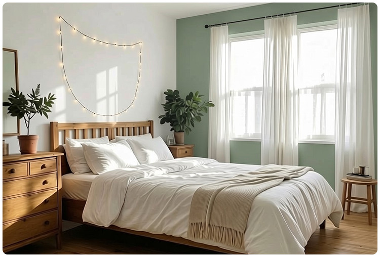
The design world has its new north star: Lofty White (PANTONE 11-4201). Declared the Pantone Color of the Year for 2026, this soft, airy hue transcends mere trend status. It represents a collective aspiration for clarity, peace, and spaciousness in our living environments. This specific shade, with its delicate balance of warm and cool undertones, has been scientifically chosen to evoke a sense of serene optimism. It’s more than just a paint color; it’s a design philosophy—one that prioritizes light, breathability, and mindful simplicity as we move into the future.

A Master of Harmony
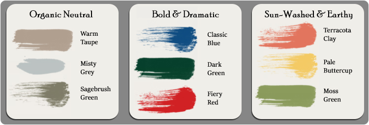
Lofty White’s official Pantone pedigree underscores its role as the ultimate harmonizer. Its calibrated neutrality makes it a flawless foundation for any color story you wish to tell. For a tranquil, layered look, pair it with other tones from the Pantone spectrum like warm taupe’s or soft, misty greys. To introduce organic vitality, it beautifully complements earthy shades such as terracotta or sage green. If your goal is bold contrast, Lofty White provides the perfect crisp, clean canvas that allows deeper jewel tones—like sapphire or amethyst—to vibrate with intensity. It is, by design, a color that facilitates rather than dominates.
Expanding Space, Inviting Light
The psychology behind Pantone’s choice is clear: Lofty White is engineered to transform spatial perception. Its high light-reflective value (LRV) works visual magic, making constrained spaces feel expansive and low ceilings feel open. By maximizing both natural daylight and artificial illumination, it banishes shadows and creates an inherently uplifting atmosphere. A room adorned in Lofty White, PANTONE 11-4201, feels immediately more inviting, optimistic, and unburdened. It’s a strategic tool for wellbeing, turning any area into a sanctuary of light and potential.
The Perfect Stage for Statement Lighting
This transformative, light-amplifying quality makes Lofty White the ideal backdrop for architectural and decorative lighting. The neutral field ensures every fixture’s form and finish takes center stage. For a definitive modern statement, high-contrast finishes like glossy black or a bold red become stunning sculptural focal points against this soft white. For a more subtle, organic, or vintage-inspired aesthetic, its warm undertones create harmony with finishes like jade green or rich, glowing brass. Even classic white or yellow fixtures gain a defined, intentional presence. In essence, Lofty White doesn’t just pair with your lighting—it curates it, ensuring each piece is showcased to its fullest, dramatic effect.
Recent Posts
-
How to Choose the Right Barn Light Finish for Your Home
Quick answer: The right barn light finish depends on three things: your home's exterior color temper …25th Sep 2026 -
6 Bathroom Lighting Setups for a Brighter Morning Routine
Quick answer: The best bathroom lighting setups for a brighter morning routine combine even, shadow- …3rd Sep 2026 -
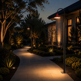
How Far Apart Should Outdoor Post Lights Be? A Complete Spacing Guide
The right spacing between outdoor post lights can completely change the look and feel of your proper …4th Aug 2026